With mobile devices accounting for over 60% of global web traffic, designing for mobile first is no longer optional — it is essential. Here are the principles that drive great mobile experiences in 2026.
What is Mobile-First Design?
Mobile-first design is an approach where you design for the smallest screen first, then progressively enhance the experience for larger screens. This ensures the core experience is solid on the devices most people use.
Core Principles
1. Content Prioritization
On a small screen, every pixel counts. Mobile-first design forces you to identify what truly matters:
- Lead with your primary message — Users should understand your value proposition within seconds
- Progressive disclosure — Show essential information first, with options to explore deeper
- Eliminate fluff — If content does not serve a clear purpose, remove it
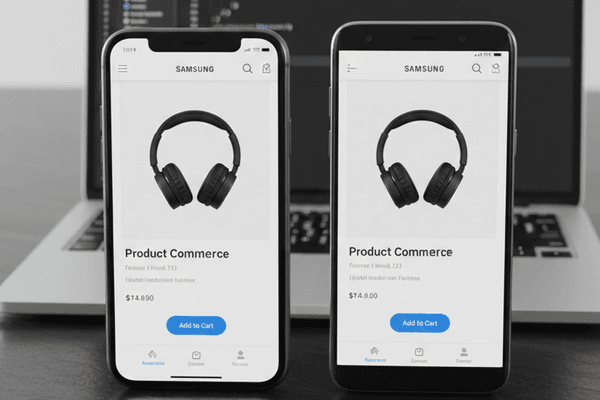
2. Touch-Friendly Interactions
Mobile users interact with their fingers, not a mouse cursor:
- Minimum tap target size of 48x48px — This prevents frustrating mis-taps
- Adequate spacing between interactive elements — At least 8px between tappable items
- Gesture support — Swipe, pinch, and long-press should feel natural
- Thumb-zone optimization — Place primary actions within easy thumb reach
3. Performance First
Mobile users are often on variable network connections:
- Target under 3 seconds for initial page load
- Optimize images using modern formats like WebP and AVIF
- Lazy load below-the-fold content
- Minimize JavaScript — Every kilobyte matters on mobile
- Use a CDN to serve assets from the nearest edge location
4. Typography That Works
Text readability on small screens requires careful attention:
- Minimum 16px body text — Anything smaller causes strain and triggers zoom on iOS
- Generous line height (1.5-1.6) — Dense text is difficult to scan on mobile
- Limited font weights — Stick to 2-3 weights to reduce load time
- Sufficient contrast — Follow WCAG AA standards (4.5:1 for body text)
5. Simplified Navigation
Complex navigation menus do not translate well to mobile:
- Hamburger menus for secondary navigation
- Bottom navigation bars for primary actions (following native app patterns)
- Breadcrumbs for deep content hierarchies
- Sticky headers that collapse on scroll to maximize content space
Advanced Techniques for 2026
Container Queries
Unlike media queries that respond to the viewport, container queries adapt components based on their parent container size. This makes truly responsive component design possible.
View Transitions API
Smooth page transitions that previously required JavaScript frameworks are now possible with native browser APIs, providing app-like navigation experiences on the web.
Variable Fonts
A single variable font file can replace multiple weight/style files, reducing download size while providing design flexibility.
Common Mobile-First Mistakes
- Hiding too much content on mobile — Mobile users deserve the full experience, just reorganized
- Ignoring landscape orientation — Many users rotate their devices
- Forgetting about accessibility — Screen readers, voice control, and switch access are used more on mobile
- Over-relying on hover states — Hover does not exist on touch devices
- Not testing on real devices — Emulators miss real-world performance issues
Testing Your Mobile Experience
Validate your mobile design with these checks:
- Google PageSpeed Insights for performance scoring
- Real device testing on both iOS and Android
- Accessibility audit using Lighthouse or axe
- User testing with actual mobile users in realistic conditions
Conclusion
Mobile-first design is not about making things smaller — it is about making things better. By starting with mobile constraints, you build focused, performant, and user-centered experiences that scale beautifully to any screen size.
Need help implementing mobile-first design for your project? Let us help you create experiences your users will love.