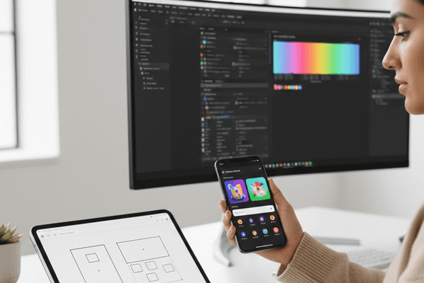
A design system is more than a component library. It is a shared language that unifies design and development, ensuring consistency across products while accelerating the creation of new features.
What Makes a Design System
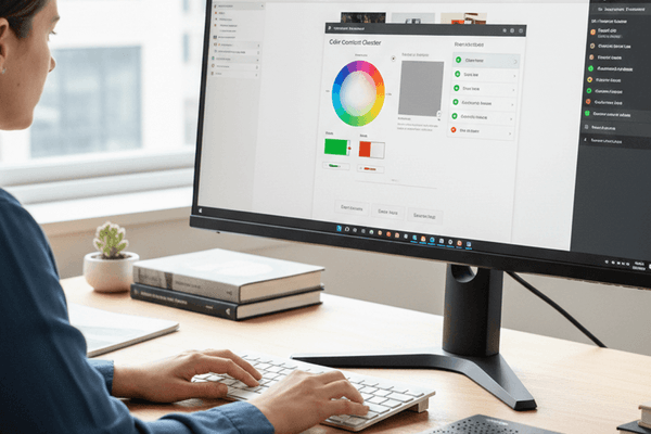
Design Tokens
The atomic values that define your visual language: colors, typography, spacing, shadows, and border radii. Tokens ensure consistency and make global changes effortless.
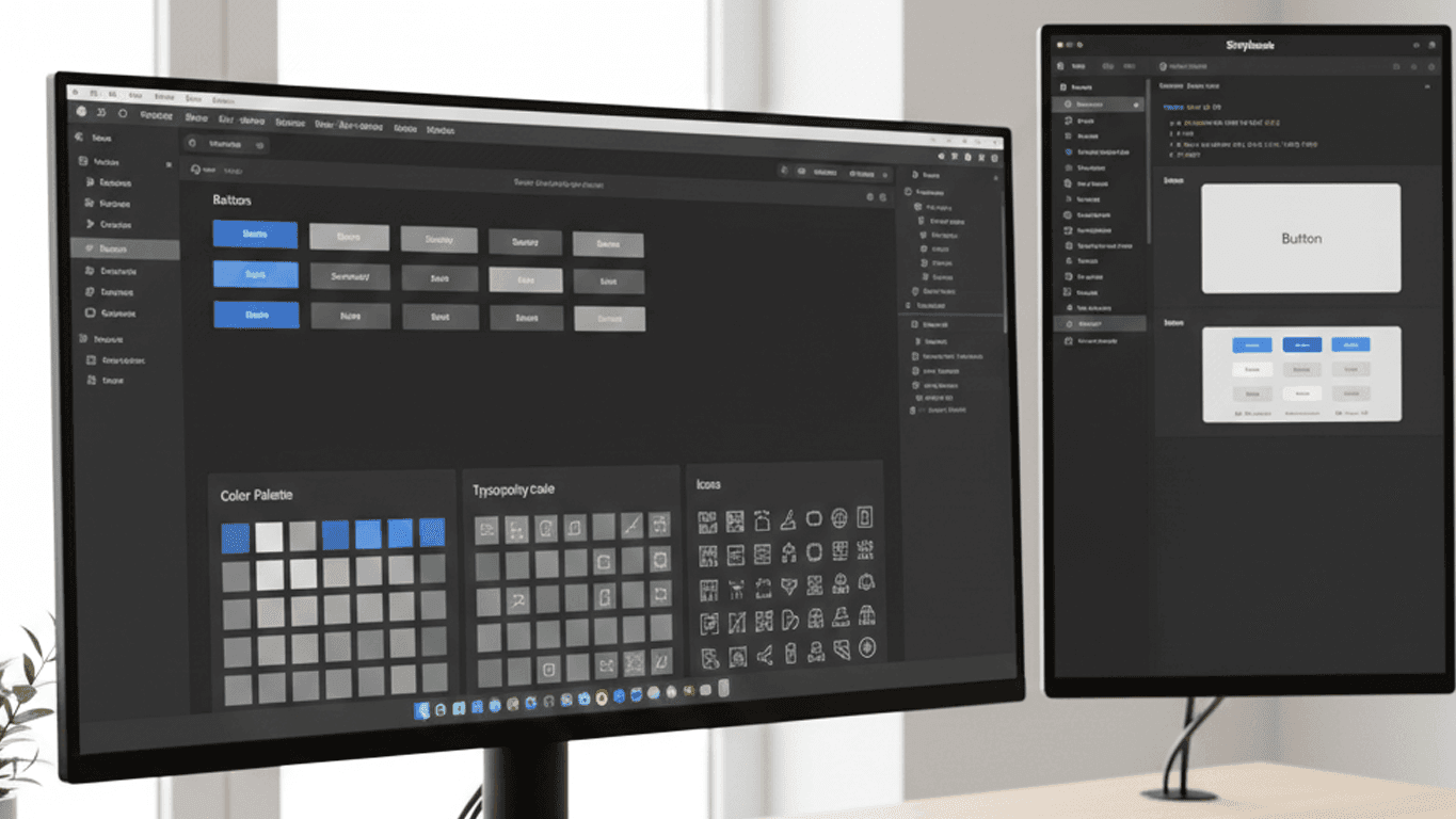
Component Library
Reusable UI components built to specification: buttons, inputs, cards, modals, navigation. Each component has defined states, accessibility requirements, and usage guidelines.
Pattern Library
Compositions of components that solve common design problems: login forms, search interfaces, data tables, onboarding flows. Patterns provide proven solutions for recurring needs.
Documentation
Comprehensive guidelines covering usage, do's and don'ts, accessibility requirements, and code examples. Good documentation is what transforms a component library into a design system.
Building Your Design System
Start with an Audit
Before building new components, audit your existing products. Identify inconsistencies, catalog existing patterns, and prioritize the components that will have the greatest impact.
Define Your Foundation
Establish design tokens first. Colors, typography, spacing, and elevation create the visual foundation that all components build upon. Use a systematic approach — spacing scales, type ramps, and color palettes with consistent relationships.
Build Incrementally
Do not try to build every component at once. Start with the most commonly used components — buttons, inputs, typography, cards — and expand based on demand.
Design and Code Together
The design system should exist simultaneously in design tools (Figma) and code. Components should be pixel-perfect matches, with the same props and variants available in both environments.
Maintaining and Evolving
Governance
Establish a process for proposing, reviewing, and approving changes to the design system. Without governance, the system drifts and loses its value.
Versioning
Use semantic versioning for your component library. Breaking changes get a major version bump, new features get a minor bump, and fixes get patches.
Contribution Guidelines
Make it easy for teams across the organization to contribute. Clear contribution guidelines and review processes encourage adoption and shared ownership.
Measuring Success
Track metrics that demonstrate the design system's value:
- Adoption rate — What percentage of products use the design system?
- Development speed — How much faster can teams ship with pre-built components?
- Consistency score — How many UI inconsistencies exist across products?
- Designer and developer satisfaction — Regular surveys provide qualitative feedback
A well-maintained design system pays dividends in consistency, speed, and quality. The investment is substantial, but for organizations building multiple products, the return is even greater.