With mobile traffic surpassing desktop for the first time in 2015, businesses that ignore responsive web design risk losing a significant portion of their audience. The shift is not just a trend — it is a fundamental change in how people access the internet.
What is Responsive Web Design?
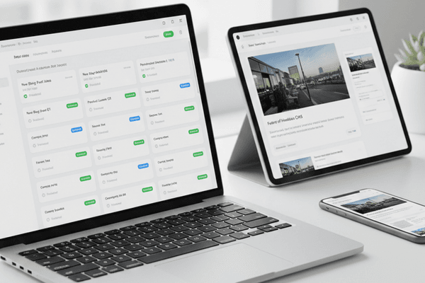
Responsive web design is an approach where a website's layout adapts fluidly to the screen size and orientation of the device being used. Instead of building separate mobile and desktop sites, a single codebase serves all users with an optimized experience.
The technique relies on three core principles:
- Fluid grids that use percentage-based widths instead of fixed pixels
- Flexible images that scale within their containing elements
- CSS media queries that apply different styles based on device characteristics
Why Mobile-First?
The mobile-first approach means designing for the smallest screen first, then progressively enhancing for larger screens. This methodology forces teams to prioritize content and functionality, resulting in leaner, faster websites.
Google's announcement that mobile-friendliness would become a ranking factor sent a clear signal to the industry. Websites that are not optimized for mobile devices face lower search rankings and reduced visibility.
The Business Impact
Organizations that have adopted responsive design report measurable improvements:
- Higher conversion rates — Users are more likely to complete purchases on well-designed mobile experiences
- Lower maintenance costs — One codebase is cheaper to maintain than separate mobile and desktop sites
- Improved SEO performance — Google rewards mobile-friendly sites with better rankings
- Increased session duration — Users spend more time on sites that work well on their devices
Key Technologies Driving the Shift
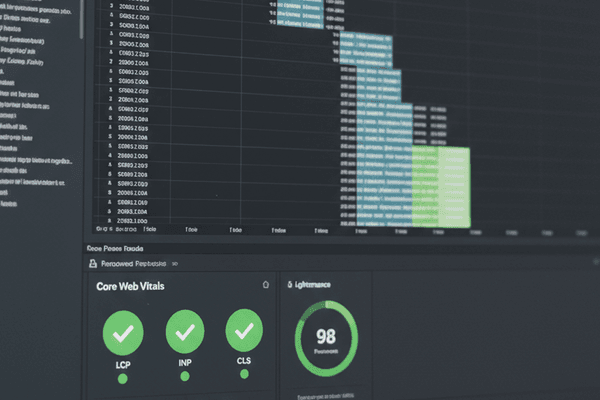
CSS3 media queries, flexbox, and emerging frameworks like Bootstrap have made responsive design more accessible than ever. Tools like Chrome DevTools provide excellent device emulation for testing across screen sizes.
The combination of HTML5, CSS3, and modern JavaScript has created a powerful toolkit for building responsive experiences that would have been impossible just a few years ago.
Looking Forward
As screen sizes continue to diversify — from smartwatches to large-screen TVs — responsive design will only grow in importance. The businesses that invest in mobile-first, responsive experiences today are positioning themselves for long-term success in an increasingly mobile world.
The question is no longer whether to adopt responsive design, but how quickly you can implement it.